
Colour Theory & Colour Wheels for Floral Design & Event Decor
SUMMARY:
- What is a Colour Wheel? A circular tool that shows how colours relate to each other and helps create harmonious palettes.
- Core Colour Schemes: Monochromatic, analogous, complementary, split-complementary, and triadic.
- 60-30-10 Rule: Use 60% dominant, 30% secondary, and 10% accent colour for balance.
- Colour Basics: Hue (pure colour), tint (with white), tone (with grey), and shade (with black).
- Warm vs. Cool: Warm colours energise; cool colours calm. Use neutrals and foliage for balance.
- Practical Use: Apply schemes to create mood—e.g., purple/yellow for contrast, monochrome for elegance.
It's not always easy to know which colours go together. Colour is a crucial aspect of floral design and event décor. Understanding how colours interact and influence the mood of an arrangement or setting allows designers to craft cohesive and visually striking palettes. This blog unpacks key colour theory principles and shows you how to use a colour wheel guide to confidently create balanced, impactful colour combinations in your designs.
The Colour Wheel: an essential tool
A colour wheel is a visual tool that displays the relationships between colours, helping you create harmonious combinations with ease. For florists, crafters, and event professionals, it’s especially useful for planning colour schemes that evoke the right mood and style. By aligning a base colour on the wheel with its complementary, analogous, or triadic matches, you can quickly identify palettes that feel balanced and intentional—whether you’re styling a bouquet, designing table décor, or crafting a custom display.


What is the colour theory rule?
The 60-30-10 rule is a classic design principle that helps create visually balanced colour palettes. It suggests using 60% of a dominant colour, 30% of a secondary colour, and 10% of an accent colour.
Examples of applying this principle include:
In a wedding setup, you might use soft ivory as your dominant tone (60%), a complementary blush or sage as your secondary (30%), and a bold accent like burgundy or gold (10%) to add depth and interest.
In the below arrangement, try blue and violet cosmos combined with yellow-orange marigolds and soft pink peonies and ceramics for a dynamic and balanced bouquet.

You can use a colour wheel to find three complementary colours by choosing a split complementary combination.
What If Three Colours Isn’t the Right Fit?
The colour wheel makes colour harmonies in many different numbers of colour combinations, such as:
- Monochromatic: Variations of a single hue (e.g., soft pink, medium pink, dark pink).
Tip: For a subtle and elegant design, choose tints and shades of a single colour like blush roses (light pink) with deeper hues like fuchsia or burgundy. For a visual example, the below explores shades of yellow-orange and shades of red.


- Analogous: Colours next to each other on the wheel (e.g., yellow, yellow-orange, orange).
Tip: For a harmonious look, consider using a combination of flowers such as yellow daffodils, orange marigolds, and peach roses. For a visual example, the below explores shades of red and red-violet.

- Complementary: Colours opposite each other (e.g., red and green). These create high contrast.
Tip: Pairing red flowers like roses or carnations with green foliage, such as eucalyptus or fern, brings out vibrancy. For a visual example, the below explores shades of blue and orange.

- Triadic: Three evenly spaced colours on the wheel (e.g., red, yellow, blue).
Tip: This is great for playful, bold designs. You could use red peonies, yellow roses, and blue hydrangeas for striking event decor. For a visual example, the below explores shades of yellow, blue-violet, and red.

Understanding Key Colour Terms
Having the vocabulary necessary to convey ideas about colour to clients, suppliers, and coworkers can be invaluable in the design process.
- Hue: The core colour itself, like red or blue, without any alterations in shade or tint.
- Tint: A hue mixed with white, resulting in a lighter version (e.g., peach is a tint of orange).
- Tip: Light pink tulips are a beautiful example of a tint, offering softness in any floral arrangement.
- Tone: A hue mixed with grey, leading to a muted, softer colour (e.g., dusty rose).
- Tip: Use dusty pink roses or mauve orchids for a sophisticated, earthy vibe.
- Shade: A hue mixed with black, resulting in a darker version (e.g., burgundy is a shade of red).
- Tip: Darker flowers like burgundy dahlias or deep plum calla lilies bring depth and drama to arrangements.
- Value: The lightness or darkness of a colour. A design with varying values adds depth.
- Tip: Combine dark purple orchids with lighter lilac sweet peas for dimension.
- Saturation (or Intensity): The vividness or dullness of a colour. Highly saturated colours are bright and clear, while desaturated (muted) colours are soft and subtle.
- Tip: To make a design pop, balance saturated flowers like red tulips with softer, desaturated tones like grey-green succulents.
Warm vs. Cool Colours
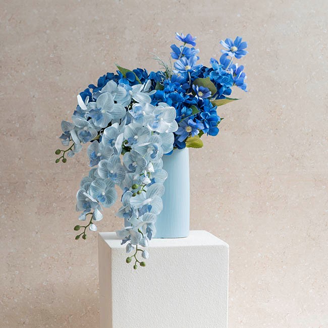
Colours are often classified as warm (reds, oranges, yellows) or cool (blues, greens, purples). Warm colours are energetic and stimulating, while cool colours are calming and receding. In design, understanding this helps balance your compositions. For example, a predominantly warm palette (like bright yellow and orange flowers) can be softened with cool green foliage for contrast and harmony. For visual examples, the below display monochromatic cool colours of blue, as well as warm multi-colours of yellow, orange, and red.

Tip: When using white flowers (often a neutral), be mindful of their undertones. White flowers can range from cool (pure white, like white lilies) to warm (ivory, like white peonies). This affects how they pair with other flowers in your palette. For a truly neutral look, consider soft whites like magnolia blossoms or creamy gardenias.
The Role of Neutral Colours
Neutral colours, like grey, white, and black, can anchor a design, allowing vibrant colours to pop. Neutral grey is especially important for balancing saturation and intensity in designs. White flowers, depending on their undertone (cool or warm), can also affect the temperature of your colour palette, which is vital for consistency in a design.

Tip: Use neutral colours like cream, beige, taupe, and ivory to balance out more vivid blooms. For example, the soft cream of a calla lily or the subtle beige of a hydrangea can help tame the intensity of brighter colours like orange or pink.
Colour and Distance
In event design, colour can be used strategically to create a sense of space. Receding colours (cool tones) tend to make an area appear larger, while aggressive (warm) colours bring elements forward, creating intimacy. This is especially useful in large spaces like weddings or conferences, where colour placement can influence the perceived scale of a room.
Tip: If you're designing for a large venue, use cool colours (e.g., lavender, pale blue, soft greens) in the background to give the space depth. Warm colours (like red roses or orange marigolds) can be used in focal points, such as centrepieces, to draw attention and create intimacy.
Examples of Colour Matching
Imagine you're designing a wedding bouquet with complementary colours. You could pair purple (violet) flowers (such as lavender or lilacs) with yellow flowers (like sunflowers or daffodils). The contrast will create visual excitement while maintaining harmony through balanced tints, tones, and shades of these core hues.
Tip: When mixing complementary colours, be mindful of the balance between warm and cool tones. If you’re using vibrant yellow and purple, add a neutral, such as white peonies or pale green ferns, to avoid overwhelming the design.
Colour theory is essential for creating cohesive and visually striking floral designs and event decor. By understanding the principles above, designers such as yourself can craft balanced and impactful florals and event decor. To learn more about colour and styling, check out our blogs Mocha Mousse – A Guide for Floral Design, Weddings, Events, and Home Décor and Top Floral Design Trends: A Comprehensive Guide.